
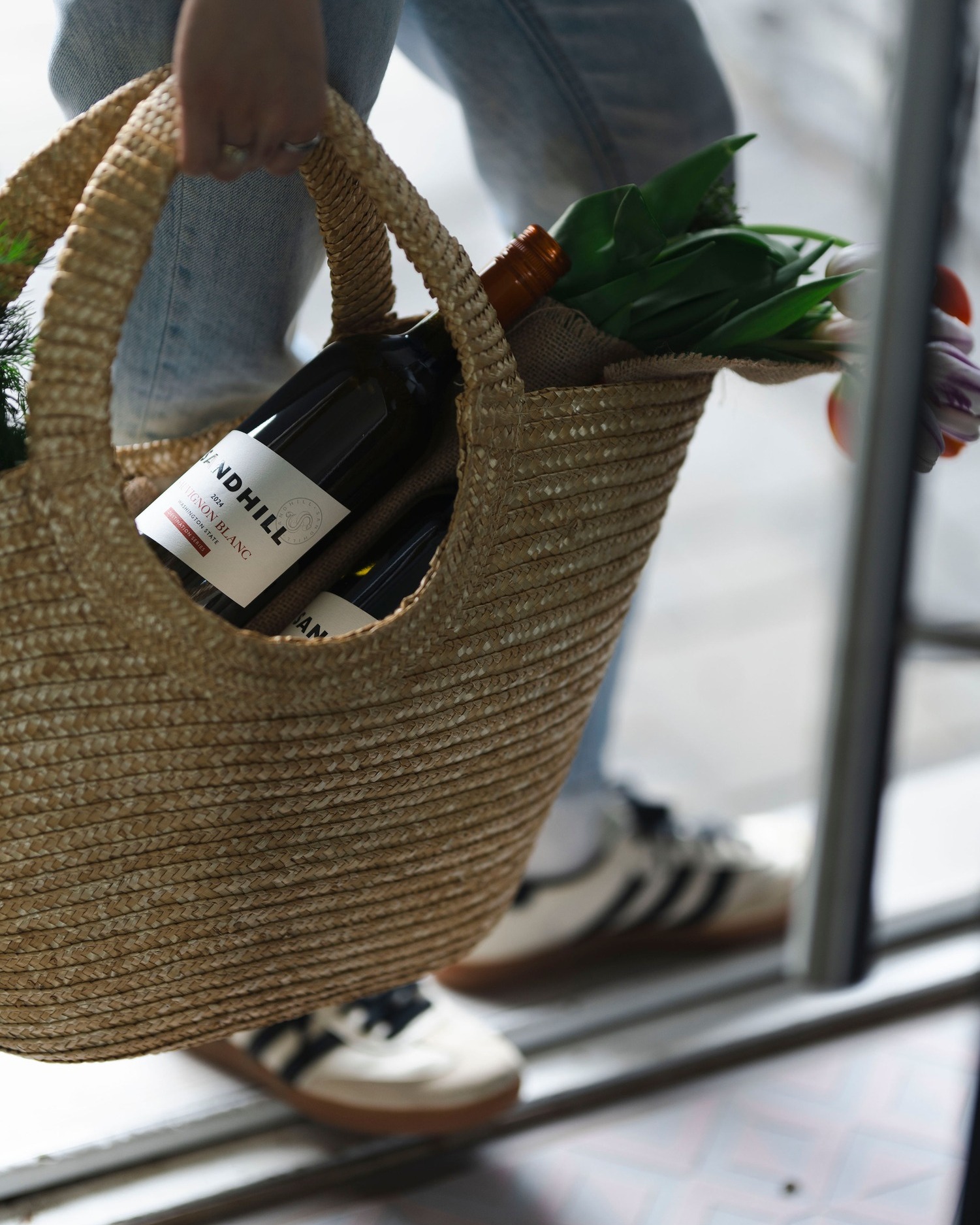
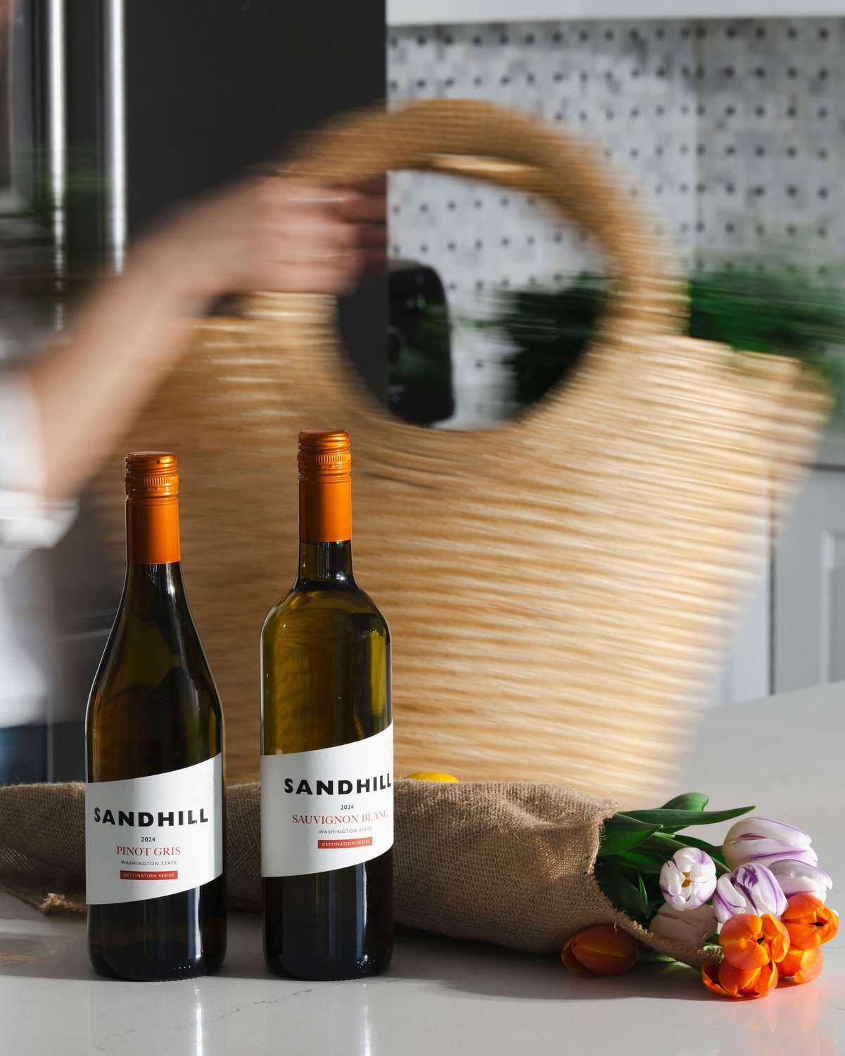
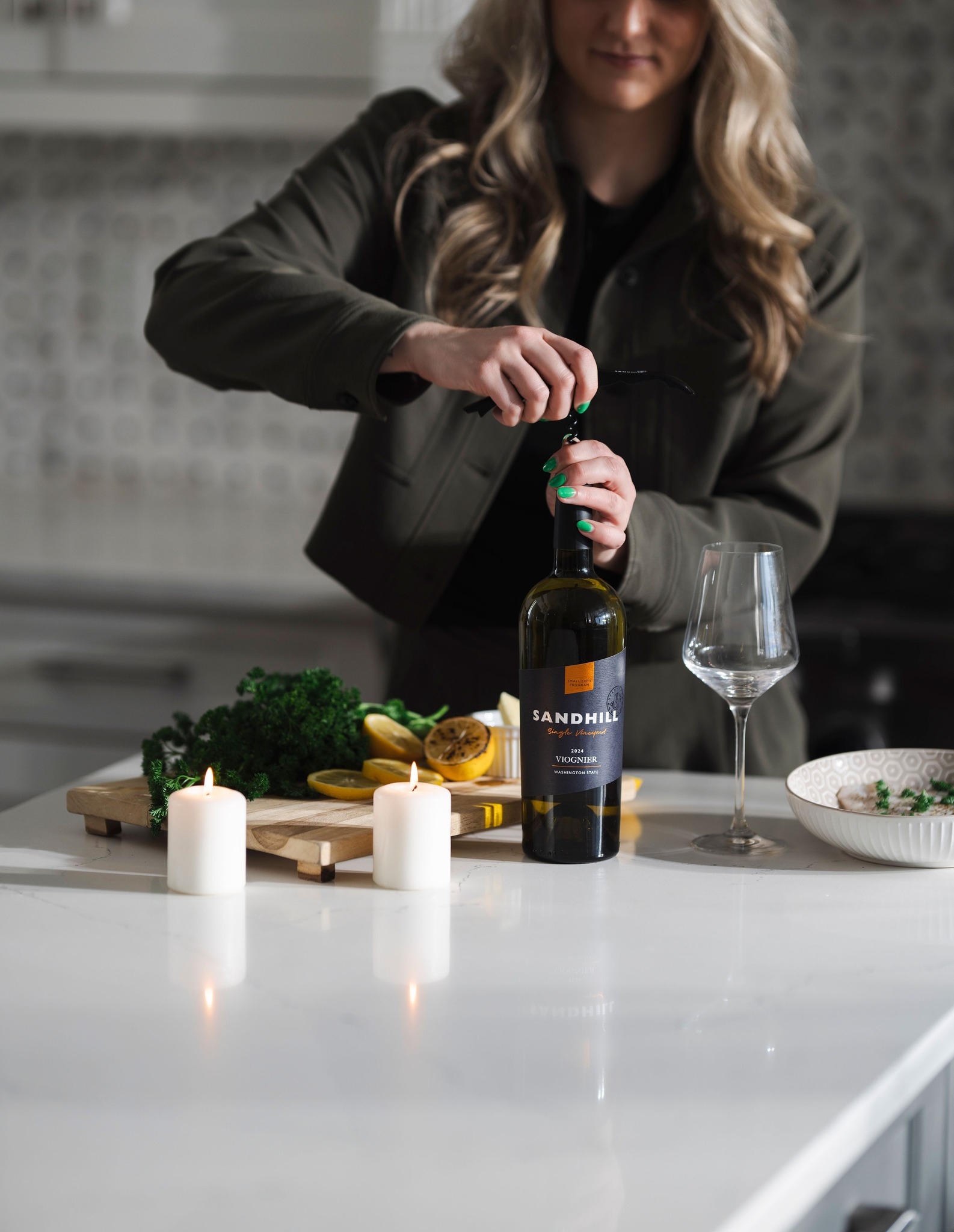
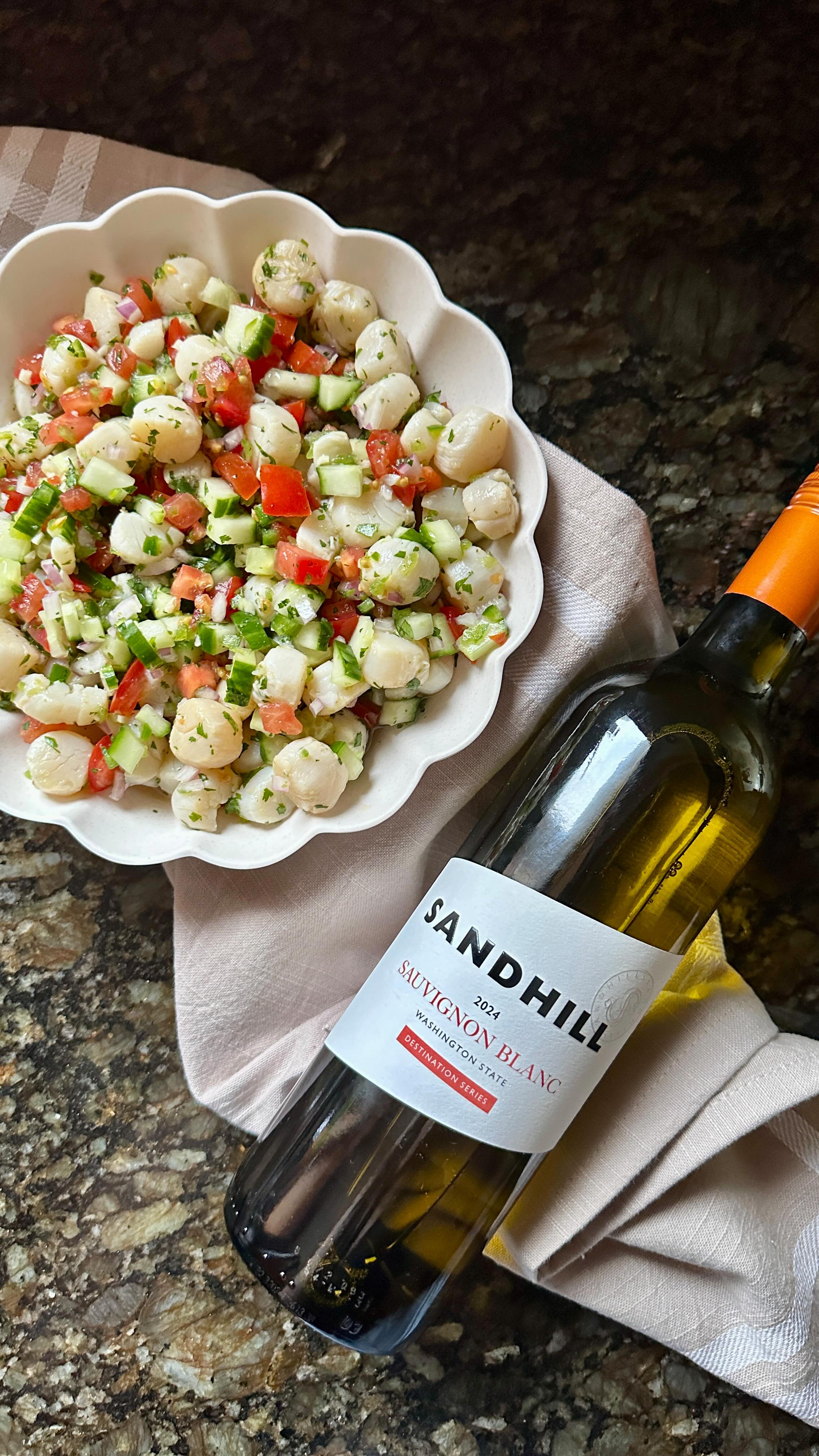
Sandhill Label Refresh
Sandhill Wines, established in 1997, has been a pioneer in producing premium BC VQA wines from British Columbia’s Okanagan Valley and Similkameen Valley. Their wines are approachable in style and made from classic varietals, becoming an essential part of their White Label portfolio.
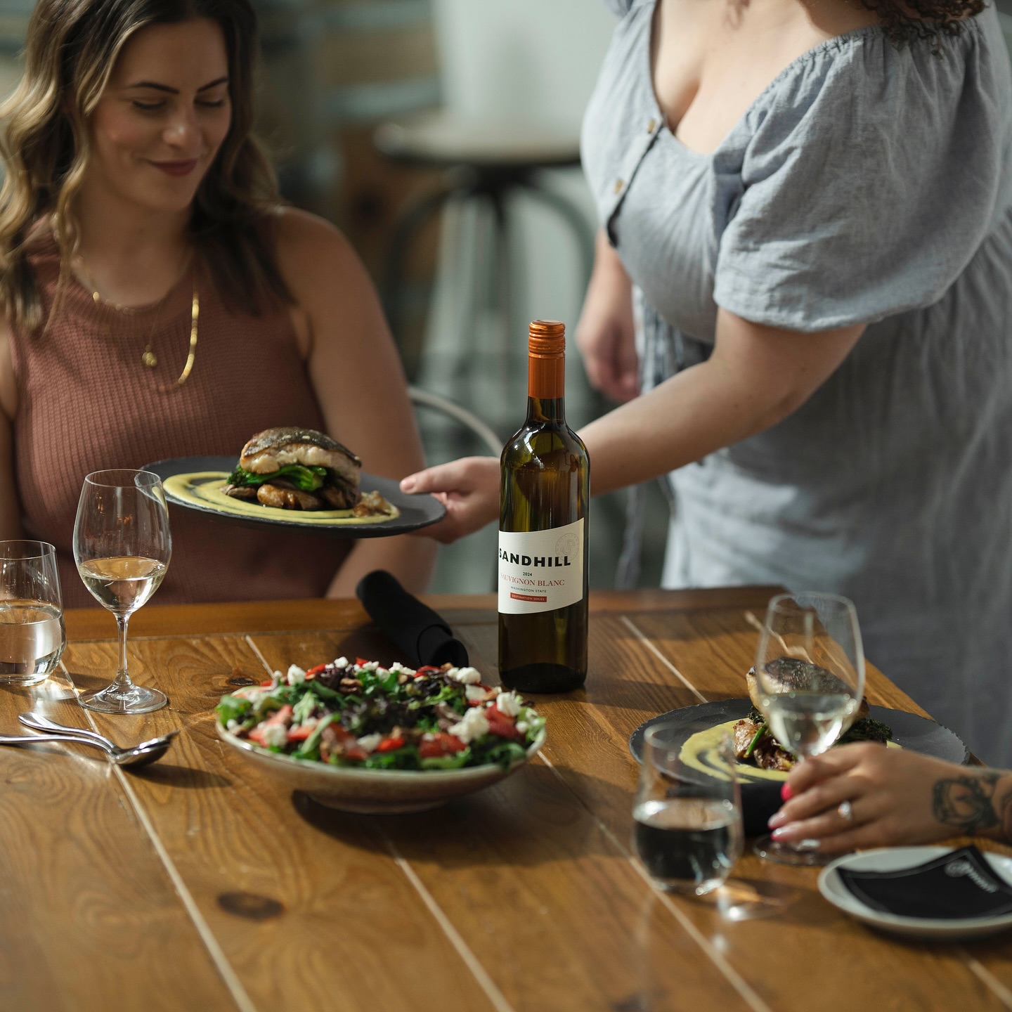
During my 12-month contract at Andrew Peller Limited, I collaborated with Creative Director Wojtek Tilbury on a label refresh for Sandhill Wines. My design concepts were selected for both the White Label and Small Lots series. One of the key creative challenges was executing the angled label design, which wraps around the bottle. Despite its complexity, the final result was highly effective—delivering a distinctive look that stands out on the shelf and draws consumer attention in a competitive market.
Our approach was to remove the ‘Terroir Driven Wine’ to be more approachable to consumers, maintain brand recognition with small incremental changes – continuing Sandhill’s stark bold look while exploring progressive improvements to increase shelf appeal and update typefaces for vintage and appellation to bring them inline with current brand guidelines. We also explored using the “S” monogram featured on the existing rosé label, while still ensuring it remained elevated from the rest of the white label tier.
Design Services
Concept Development
3D modeling
Label Design
